Gary Proudley

Writer of Comics

G

Latest stories

Allegory of the Cave – script to final product

This week Mitch Collins, Wolfgang Bylsma, the fine people at Gestalt comics, and I have a Kickstarter for Allegory of the Cave, an adaptation of the famous section of Plato’s Republic. In honour of that, I thought I would share a little bit of the process that goes in to making a comic. In this case, adapting a dialogue that is a little over two thousand years old.

The first step (usually) in making any comic is the script.

Page 2 of Allegory of the Cave Script

This is more or less what was passed on to Mitch. I had Mitch in mind for the script at this stage, but I had no idea if he would be on-board, so I kept notes for the artist non specific. As you can see, this page is slightly unusual in that it has two establishing shots. I wanted to have a contrast of the bright light in the first panel with the darkness in the second panel. Ultimately Socrates and Glaucon in the first panel are representative of being educated, (being in the light) and that needed to be contrasted with the people in the cave. There are also some notes for the letterer in there. We needed the book to be immediately visually clear who was talking. We decided to do this by colour coordinating caption boxes and word balloons with what Glaucon and Socrates were wearing. This allowed for clarity even to people unfamiliar with comics, which I expected would make up a large proportion of our readers.

From there we move to thumbnails.

Page 2 thumbnails

As you can see these are incredibly loose. At this stage, all Mitch is trying to do is lay out the general blocking of the page. Thumbnails help to give a quick guide to the flow of the page, and make sure that the weighting of images works. In this instance it is quite a simple page, but nonetheless it is incredibly important for the rest of the book. If the reader doesn’t have a good sense of the space of the cave, they will be confused about the setting and blocking. Drawing thumbnails quickly also can help an artist to develop the flow of the eye over the page. It is a little hard to tell here, but in the second panel Mitch is directing the reader to start with Socrates’ head, and down onto the fire, the walkway for shadows, and then finally to the prisoners in the cave.

It is easier to see in the next stage, the pencils.

Page 2 pencils

Now the page is starting to come together. At this level Mitch has made the excellent decision not to have any people carrying objects for shadows through the walkway. Having them on this page would only add visual clutter, and confuse the image. Much of comics is about deciding not only what to draw, but also what not to draw. Also note that in this page, in contrast to the thumbnails, Mitch has drawn the prisoners in negative space. This helps draw attention to them, show them as isolated, and increase their importance on the page subtly to the reader. Comics is a powerful medium. Importance can be added to elements of the narrative without the reader being consciously aware of it.

Next comes the inking.

Page 2 inks

The major difference you will find here is the change in Socrates’ floating head. In the pencils, Socrates is looking over to the right side of the page. In this revised version he is looking directly down at the prisoners in the cave. The reader will naturally follow Socrates’ line of sight. Mitch is using every weapon in his arsenal to direct the reader through the page. Even at this seemingly later stage, improvements can be made.

Then things start to come together with colours.
Page 2 colours

Now the page is close to complete. Mitch has used the colour to help direct the flow of your eye around the page. Moving from Socrates’ head in panel two down to the prisoners is reinforced by the colour of the fire, where your eyes move to straight after Socrates. On page one the colours for Glaucon and Socrates were established, and here on page two Mitch reinforces them in panel two without hitting the reader over the head.

The establishing and reinforcing of those colours is important for the lettering.

Page 2 lettered.

And now you can see the finished page, where all the elements come together. There are many steps that go into making a comic, even for an apparently simple two panel page like this. Many people bring their skills to bear, hopefully in the interest of creating something greater than any one person could do on their own.

If you have enjoyed this, I encourage you to go over to the Kickstarter page, back the book, and perhaps share it with others on social media.

A review that “gets it”

What are the best things in life? To crush your enemies, to see them driven before you, and to get a review where they just “get” what you’re going for!

Soda And Telepaths Review Quote
A new level of webcomic story telling.

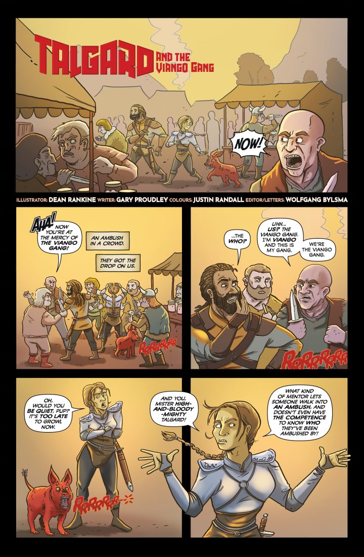
Anthony Pollock from Soda and Telepaths reviews the two most recent Talgard stories, Talgard and the Face in the Wall and Talgard and the Mardok Sphere.

Soda and Telepaths is one of the best review sites for comics, and I’m extremely happy to have been reviewed by Anthony Pollock. Anthony knows comics and pop-culture inside and out, and is a really nice guy to boot. While you’re there you should check out their other reviews, interviews, and podcast.

Talgard and the Face in the Wall has art from Cody Anderson, with colours by Justin Randall and letters/edits by Wolfgang Bylsma.

Talgard and the Mardok Sphere contains art from Gary Chaloner, with colours by Justin Randall and letters/edits by Wolfgang Bylsma.

Talgard


The Store